AI Report Automation: Let Your Weekly Numbers Explain Themselves
Published 2026-09-18 · Updated 2026-09-18 · 8 min read · ShooWork (FreeCo Co., Ltd.)
How we replaced a half-day of manual reporting with an automated weekly summary that says what moved, why, and what to do next, with no invented numbers.
Most operations meetings run the same way. Someone spends half a day pulling numbers from the admin panel, Google Analytics, the ads dashboard, and a few spreadsheets, then pastes them into a deck nobody reads closely. The founder asks 'so what does this mean?', the room goes quiet for three seconds, and everyone starts improvising. All the data is there. The conclusions are guesswork.
AI report automation fixes that specific gap. The idea is not to generate more charts. It is to have a system compute your weekly metrics, filter for what actually changed, and hand your team a short plain-language summary: which numbers moved, by how much, the likely reason, and what deserves a look. You read three sentences instead of a hundred cells.
We run ShooWork, an AI tools platform with a subscription business and paid ads behind it, and our weekly numbers used to be assembled by hand exactly like the scene above. Today, every Monday morning, a scheduled job posts last week's summary into our team chat before anyone has opened a dashboard. This article walks through how that works and, more importantly, the design decisions that keep it trustworthy.
Leadership doesn't want reports. It wants decision material.
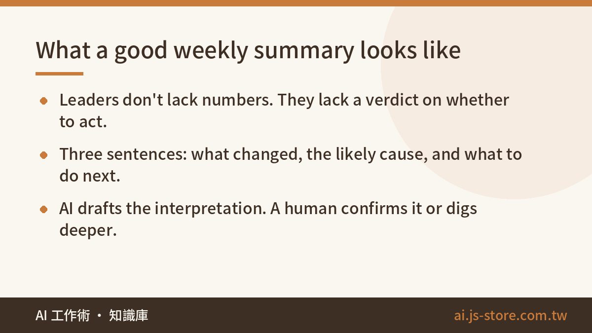
Start with the honest question: what is your boss, or you as the founder, actually missing? It is almost never the numbers. The numbers exist. What is missing is the interpretation: what do these figures mean, and do I need to act this week?
A traditional dashboard hands you a hundred metrics and leaves the interpretation as your job. AI report automation flips that. The system produces a first-draft interpretation, and a human confirms it or digs deeper. That is the whole value proposition, and it is why a good summary is short.
Here is the shape of a summary we would consider good:
Revenue fell 12% week over week. The main driver is Product X going out of stock from Wednesday, which normally contributes about a fifth of revenue. Ad spend was flat while conversion rate rose, so traffic quality is not the issue. Suggested action: confirm the restock date, and shift budget to Category Y while X is unavailable.
Three sentences. A change, an attributed cause, a recommendation. That is analyst-level first-pass work, and it shows up on time every week without anyone chasing it. Compare it with a slide of twelve bar charts and no verdict, and you understand why our team stopped building the slides.
Architecture: compute the numbers first, then let the AI talk
Here is the mistake most teams make on their first attempt, and we made a version of it too: they dump the raw export into a large language model and ask it to calculate and explain everything in one go. Don't do this. Language models are unreliable at arithmetic, and worse, you cannot audit the arithmetic they did. If the summary says revenue dropped 12% and the real number is 8%, you will find out in the meeting.
The split that works has three layers, and the boundaries between them matter more than any prompt.
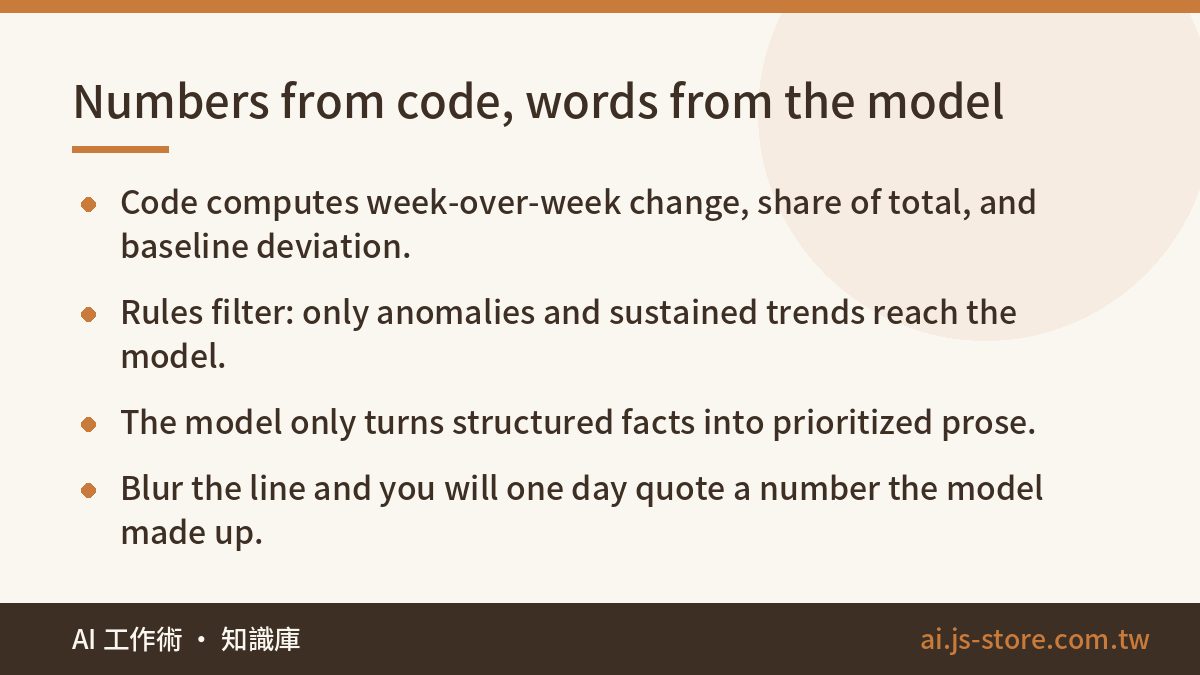
- Code does the math. A scheduled job pulls data from your database and platform APIs, then computes week-over-week changes, share of total, and deviation from historical baselines. All of it is deterministic code. If a number is wrong, you can trace it and fix it.
- Rules do the filtering. Not every metric deserves a sentence. Set thresholds: a change larger than a set percentage, or a deviation of more than two standard deviations from baseline. Only anomalies and sustained trends move to the next step. Everything else stays in the dashboard.
- The model does the writing. The computed metrics, the flagged anomalies, and the relevant business context go to the model, which produces the summary. It does only what it is good at: turning structured facts into fluent, prioritized prose.
One rule summarizes the whole design: numbers come from code, words come from the model, and the line between them never blurs. Hold that line and every figure in the summary is traceable back to a query. Lose it and you will eventually quote a number in a board meeting that the model made up.
This is the same discipline we apply across our own tooling. Our ad-adjustment system, which we describe in our daily Google Ads adjustment playbook, computes the bid and budget signals in code and only uses the model to explain and prioritize. Reporting is no different.
Three details that give a summary its judgment
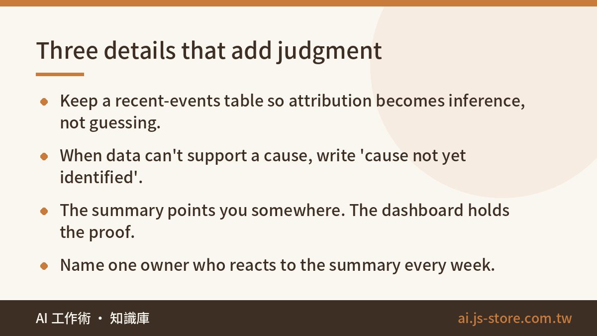
Feed it business context. The model has no idea you launched a promotion last Wednesday, or that a competitor cut prices, or that a shipment got stuck at customs. Without that, attribution is a guess dressed up in confident language. We keep a lightweight 'recent events' table: campaigns, site changes, stockouts, pricing moves, ad budget shifts. It gets appended to every summary request. The moment we added it, attribution went from plausible-sounding fiction to reasonable inference, because the model could connect a revenue dip to a stockout that actually happened.
Say less rather than invent. Instruct the model explicitly: when the data cannot support a cause, write 'cause not yet identified' instead of manufacturing one. This is the single most important line in the prompt. A founder's trust in an automated report survives a lot of things, but it does not survive one fabricated explanation. Once someone catches the system guessing, every future summary gets read with suspicion, and you are back to manual interpretation with extra steps.
The summary points; the dashboard proves. The summary and the dashboard are partners, not rivals. The summary's job is to tell you where to look. When something in it surprises you, you go to the dashboard and drill into the detail. If your summary tries to contain everything, it becomes the deck nobody reads. Keep it short and let the dashboard hold the depth.
One more detail that is about the team rather than the prompt: name who is responsible for reading it. An automated report that lands in a chat channel with no owner is just automated noise. Ours has one named person who reacts to it every Monday, even if the reaction is 'nothing to act on this week.'
What it costs and what it saves
Be realistic about the build. This is not a weekend project, but it is a contained one. The data pipeline is the bulk of the work: getting reliable weekly numbers out of your store platform, analytics, and ad accounts and into one place. If you already have a warehouse, or even a clean set of scheduled exports, you are most of the way there. The anomaly rules are an afternoon. The model layer is the smallest piece, and the place where people over-invest.
On the savings side, count two things. The first is the obvious one: the half day per week someone spent assembling numbers, which adds up to roughly 25 working days a year. The second is harder to measure but larger: the interpretation gap. Every week your team spent looking at numbers without a conclusion was a week of decisions made late or not at all. A stockout that costs a fifth of revenue and gets noticed on Thursday instead of the following Monday is worth more than the labor saving.
Model costs for this workload are small because the model only sees a few hundred tokens of structured facts once a week, not your raw data. Check the official pricing page of whichever provider you use, but for a weekly summary the inference bill is not the number that should worry you. The data plumbing is.
One cost people forget: security review. Your report pipeline touches revenue data and customer metrics. Before you wire a model into it, run through the checklist in our AI security basics article, especially what data leaves your environment and who can trigger the job.
Start with one weekly report
The order of operations matters. Do not begin by automating every report you have. Pick one, the one you genuinely read every week. For most businesses that is either the revenue weekly or the ad performance weekly.
- Automate the metric calculations for that single report. Get them to the point where you trust them without opening the source dashboard.
- Add the anomaly rules and check for a couple of weeks that the flagged items match what a human would have flagged.
- Add the model summary layer, with the 'recent events' context and the 'cause not yet identified' instruction from day one.
- Run it for a month. Keep a note of what leadership actually asked as follow-up questions after each summary.
- Adjust what the summary covers based on those questions, not on what you imagined would be useful.
That fifth step is where the real design happens. The questions your boss asks after reading the summary are the specification for the next version. If they always ask about a specific product line, the summary should already answer it. If they never ask about a metric you include, drop it.
The goal of report automation is not more reports. It is to change the first management action of every week from 'find the numbers' to 'make the decision.' If you want to see how this fits into a broader routine, our team's honest AI work routine covers where reporting sits among the other things we automate, and the ShooWork tools page lists what we have packaged for other teams.
FAQ
Q: Can I just paste my spreadsheet into a chatbot and ask for a summary?
You can, and for a one-off it works fine. As a weekly process it fails in two ways: the model may miscalculate, and you cannot verify which numbers it used. Compute the metrics in code first and give the model only the results.
Q: How do I stop the AI from inventing explanations?
Two things. Supply a table of real recent events so it has true causes to reference, and instruct it to write 'cause not yet identified' when the data does not support attribution. Then spot-check the first month of summaries against your own reading.
Q: Does this replace my dashboard?
No. The summary tells you where to look. The dashboard is where you drill into detail. Teams that try to make the summary comprehensive end up with the same unread deck they started with.
Q: What data sources should the first version cover?
Only the ones behind the one report you chose. Typically that is your sales or subscription database, web analytics, and your ad platform. Add sources later, after the first summary has proven useful for a month.
Q: How much technical work is involved?
Most of the effort is the data pipeline: reliable weekly numbers pulled into one place. The anomaly rules and the model prompt are small by comparison. If you already have clean scheduled exports, this is a contained project rather than a platform build.